Design Challenge
A great community provides a variety of amenities and a dedicated staff responsible for its maintenance . But there isn’t always an easy way for community members to report problems to management so they can be resolved quickly.
Design a system for a community of your choice, so members can report issues and track their resolutions.
Discovery and Research
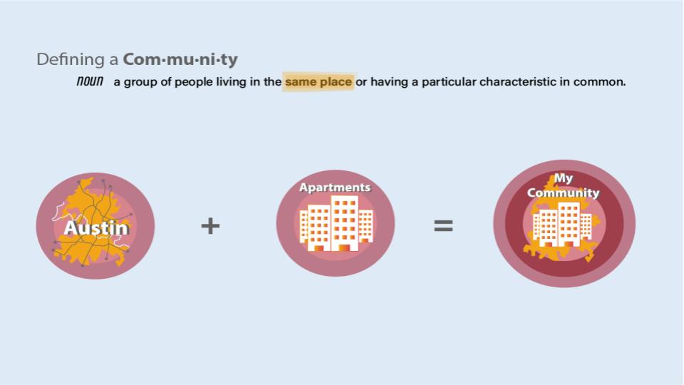
I began by defining the community that I would be designing for and then began my generative research in order to develop a deeper understanding of my users to find opportunities for solutions.
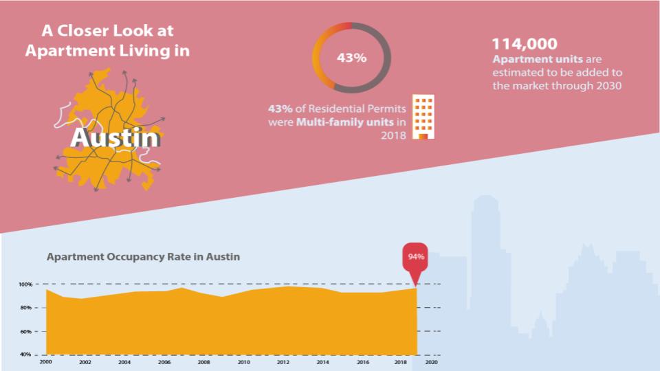
From the research we can see that a vast amount of people are living in apartment communities. The max occupancy rate of these communities is at 94% and climbing.
So that got me thinking… What challenges are tenants facing while living in these communities and how are property managers meeting their needs?
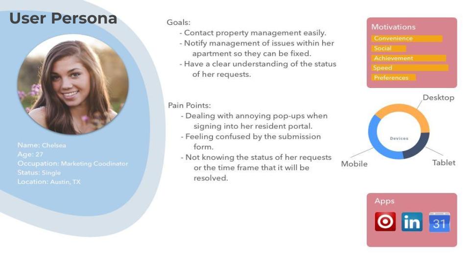
While trying to navigate the recent pandemic shut down, I was able to virtually interview a few apartment dwellers who all seemed to be struggling with their current community web-portals when it comes to submitting maintenance requests. From these interviews, I was able create the following user persona.
Problem Statement
How might we set up an effective complaint resolution system that enables apartment residents to have their maintenance requests resolved quickly and smoothly?
In the interest of time, I decided to conduct a heuristic evaluation of the current online system that is used by my apartment community to see how I can re-design it to meet the needs of my users.
Insights
- Users are mostly using a mobile device to accomplish their tasks.
- Modals cause more distraction and annoyance within the current design.
- Users expect a response promptly and ideally would like a time frame provided for their issue to be resolved.
- The apartment conditions directly affect the residents’ feeling of comfort and well-being.
Wireframe: Submit Maintenance Request


In this iteration, I received feedback from users that there was some confusion created with the mixture of horizontal scrolling for payment and vertical scrolling in the maintenance request.
UI Development and Visual Design
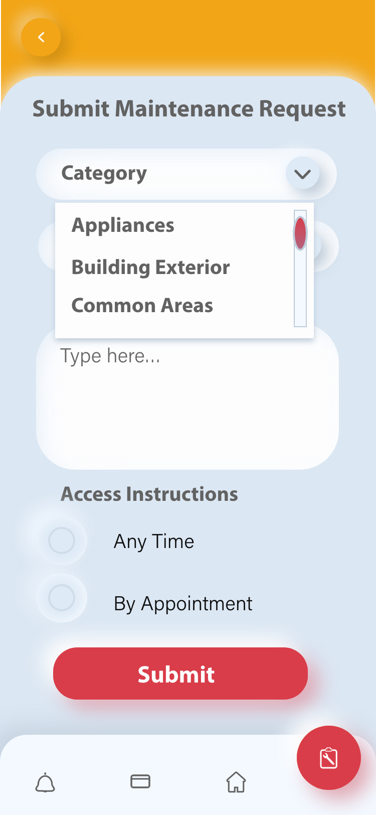
When moving to my hi-fi mockup, I decided to go with a neumorphic design to deliver an entirely unique experience for users. It’s true that like all trendy design styles, neumorphism comes with both good and bad sides.
The Good… my users were excited by the freshness and thought it was appealing as a visual style.
The Bad… users had trouble distinguishing buttons. That’s a huge usability issue!! Which got me to thinking about accessibility. How would it appear to visually impaired users? Chances are that it would be a real problem, with crucial things disappearing into the background, becoming unusable.
The Ugly… it was my first time designing an icon set so it took me longer than expected to design. This was a great learning experience and I’m excited to refine my skills to deliver more cohesive sets in the future.
Eliminating the pesky modal
The modal that pops up when the user logs on was seen as an annoyance and ignored by all users. The current platform allows for request submission but gives no indication to the user that their request will not be attended to unless it is considered an emergency.

In the new design, notification alerts were added to inform the user why their request won’t be accepted, but also gives them an option to complete their task by calling into the office hotline in case of emergency.

View Adobe XD prototype here
Retrospective
- I would’ve liked to explore more of users’ attitudes, preferences, and opinions during the generative research phase to ensure that my solution addressed their true needs.
- I’ve learned the usability and accessibility limitations that the neumorphic visual design created.
- More evaluative research throughout the development of this solution to see if it meets people’s needs, is easy to access and use, and is hopefully even enjoyable.
